









Immersive museum of Madeira v.01
What follows is a series of early explorations — branding directions, visual concepts, and modular ideas that can evolve, merge, or stand on their own. Each proposal taps into a different facet of immersion, technology, and Madeira’s layered identity — from pixel-based typography to hypnotic topography, from LED-inspired forms to dynamic symbol systems. These are starting points, not final answers. But they already speak the language of the museum: a place where the physical and digital blur, and where branding isn’t static — it moves, listens, and responds.
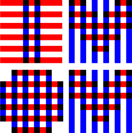
Neon STRIPES
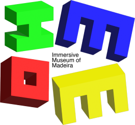
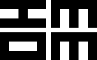
By crossing over simple linear stripes, IMOM emerges — bold, minimal, and unmistakable. The visual language echoes LED light strips and immersive lighting systems, making it feel instantly native to the museum’s environment — from outdoor signage to indoor installations. The logo exists in both monochrome and full-spectrum color versions, ready to shift tone or mood depending on the space. It’s simple. It sticks. And it might just be the most versatile path forward.
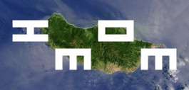
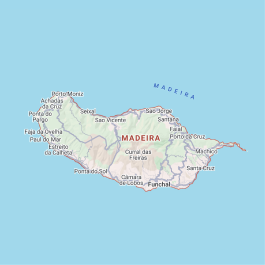
madeira mon amour (from above)
A reinterpretation of Madeira’s topography — part map, part memory. This logo channels the hypnotic curves of isohypses (elevation lines), abstracted into a flowing, almost meditative form. It’s rooted in place, but feels fluid, immersive, and alive. It’s designed to move: easy to animate, perfect for slow reveals, transitions, and immersive screen moments.
IM🌎M
This logotype is built from just three simple shapes — |, /, and O. The “O” becomes a mutable, animated symbol — a screen, a portal, a world, a moment. It can shift depending on the context or stay static for print. This is the dynamic branding system I’m after: ultra-minimal, flexible, and expressive — where identity isn’t fixed but always in motion.
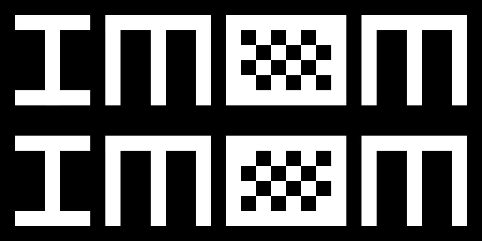
32x8
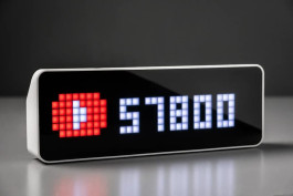
It all started with my search for a simple, hackable digital display — something I could use throughout the museum, both indoors and on the street. That’s when I came across the Ulanzi TC001 Smart Pixel Clock, and its humble 32x8 pixel grid became my design constraint. Working within that limitation, I developed a custom typeface tailored to this resolution — a raw, modular identity that can live directly on the device itself. The dynamic “O” became a key feature — a character that can act as a live pixel display, clock, or animation space, making the logo itself part of the immersive system.
MNML
I pushed readability to the edge — reducing the letterforms to a 5×3 pixel grid and building a blocky, minimalist typeface from scratch. It’s a typographic experiment that feels native to the medium: tech-driven, screen-first, and unapologetically digital. This is what immersive media looks like at its most distilled. No frills. Just raw, modular identity.
mersi frumoS
© CIAO MIKI 2025
www.omnormal.com
Immersive museum of Madeira v.01
What follows is a series of early explorations — branding directions, visual concepts, and modular ideas that can evolve, merge, or stand on their own. Each proposal taps into a different facet of immersion, technology, and Madeira’s layered identity — from pixel-based typography to hypnotic topography, from LED-inspired forms to dynamic symbol systems. These are starting points, not final answers. But they already speak the language of the museum: a place where the physical and digital blur, and where branding isn’t static — it moves, listens, and responds.
Neon STRIPES
By crossing over simple linear stripes, IMOM emerges — bold, minimal, and unmistakable. The visual language echoes LED light strips and immersive lighting systems, making it feel instantly native to the museum’s environment — from outdoor signage to indoor installations. The logo exists in both monochrome and full-spectrum color versions, ready to shift tone or mood depending on the space. It’s simple. It sticks. And it might just be the most versatile path forward.
madeira mon amour (from above)
A reinterpretation of Madeira’s topography — part map, part memory. This logo channels the hypnotic curves of isohypses (elevation lines), abstracted into a flowing, almost meditative form. It’s rooted in place, but feels fluid, immersive, and alive. It’s designed to move: easy to animate, perfect for slow reveals, transitions, and immersive screen moments.
IM🌎M
This logotype is built from just three simple shapes — |, /, and O. The “O” becomes a mutable, animated symbol — a screen, a portal, a world, a moment. It can shift depending on the context or stay static for print. This is the dynamic branding system I’m after: ultra-minimal, flexible, and expressive — where identity isn’t fixed but always in motion.
32x8
It all started with my search for a simple, hackable digital display — something I could use throughout the museum, both indoors and on the street. That’s when I came across the Ulanzi TC001 Smart Pixel Clock, and its humble 32x8 pixel grid became my design constraint. Working within that limitation, I developed a custom typeface tailored to this resolution — a raw, modular identity that can live directly on the device itself. The dynamic “O” became a key feature — a character that can act as a live pixel display, clock, or animation space, making the logo itself part of the immersive system.
MNML
I pushed readability to the edge — reducing the letterforms to a 5×3 pixel grid and building a blocky, minimalist typeface from scratch. It’s a typographic experiment that feels native to the medium: tech-driven, screen-first, and unapologetically digital. This is what immersive media looks like at its most distilled. No frills. Just raw, modular identity.
mersi frumoS
© CIAO MIKI 2025
www.omnormal.com
Select ticket types and quantities to continue.
Choose an available date and timeslot.